Using COVID-19 to Explain Community Detection (Part I)
Illustrating a use case for the Louvain algorithm
Explaining domain topics to someone far outside that domain is an activity that’s as challenging as it is enriching. How do you tell someone who struggles with concepts like copy/paste how programming works? Can you explain to a person who hasn’t taken a biology class in decades why long non-coding RNAs are interesting? If your friend randomly comes across the Louvain algorithm in a blog post but doesn’t know what a graph is, what do you say?
The last of these examples happened to me recently. My friend Sherry messaged me this screenshot of a blog post:
and said…
this seems very cool, i’d like to understand how he did this
What a random, happy coincidence. I relied heavily on the Louvain algorithm in grad school. Sherry is primarily non-technical but infinitely curious, so I decided to tackle a ground-up illustration of the algorithm. Here’s a cleaned-up and slightly expanded recounting of the illustration.
What if you’re leading the COVID-19 response team?
I wanted to begin the explanation with a motivating example for situations in which Louvain might be applied. Given that COVID is on everyone’s minds at the moment, it seemed appropriate.
Imagine you’re leading the COVID-19 response team. Trump comes up to you and says, “Hey. We’ve just secured the funds to hire between 10,000 and 100,000 Community Liaisons. Each of these Liaisons will represent a group of Americans who are likely to transmit coronavirus to one another. You need to figure out which people are most likely to give coronavirus to which people and make sure that each American has one and only one Community Liaison.” What do you do?
This example isn’t perfectly realistic, so allow a little creative license here. It’s relevant and easy to understand.
The problem does have a number of layers, though, so let’s start to disentangle them. The first decision is how to measure the likelihood that a single individual could transmit coronavirus to another individual. There are many factors which could play into this:
- How close do the two people live to one another? Two people living on the opposite sides of the country are unlikely to come in contact.
- Do they call each other? My parents and I live in separate states, but I’m more likely to visit them than a majority of my neighbors.
- Do they frequent the same public locations? Even neighbors might never see each other if they have different jobs, hobbies, etc.
- Are they friends on social media? Friends are much more likely to spend time together than two random people.
- Do they work together?
There are many other questions you could ask. I’m not going to dive into the specifics of how to create this score, but let’s assume that you use questions like the ones above to assign each American a long list of probabilities (>300M of them, each between 0 and 1), which represents the likelihood of that individual giving coronavirus to every other American.
At this point, you can also imagine that we have an enormous Excel spreadsheet. The names of all 300M people are both the first row for all columns, and first column for all rows. Every other cell in this table is filled with the transmission probabilities we just described.
One other thing to consider is the fact that a vast majority of people have ~0% chance of transmitting to one another. It’s very common to “threshold” a graph. Here, we could threshold our probabilities at 0.01. If the probability between two people is <0.01, we round it down to 0 and do not draw an edge between the nodes.
Network visualization
If you’re familiar with this stuff, all I’ve said so far is:
Imagine you have an adjacency matrix representing a graph of all Americans.
If you’re not familiar with this stuff, the above sentence likely doesn’t mean much. A graph is the mathematical term for the concept we’re building. Graphs are also interchangeably known as networks. Networks are often visualized as collections of circles and lines:
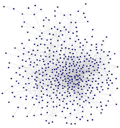
Or maybe like this:
In these images, each of the circles is called a “node”. Generally, nodes in a graph represent nouns (in our example, people). Similarly, each of the lines between the nodes is called an “edge” and represents a relationship between the nodes (in our example, likelihood of transmission).
Note: The location of nodes in a network visualization may or may not convey any information. Sometimes they’re placed at random, and sometimes the closer two nodes are to each other the stronger their relationship is. It depends on the visualization method. For the purposes of our example, it’s important to clarify that a visualization of nodes representing people would have no direct relationship to the geographic location of those people.
We have a graph. Now what?
Going back to our hypothetical task, we want to hire Liaisons where:
Each of these Liaisons will represent a group of Americans who are likely to transmit coronavirus to one another.
Now that we have a graph we need to find our groups, or communities, of people who are likely to transmit to each other and therefore should be represented together by a single Liaison. How do we do this?
Looking back at the second example graph, it might be tempting to say, “Let’s visualize the graph so that the more likely two people are to transmit the closer they are in the image.” Then, we can just draw circles around our communities.
At first glance, this isn’t a terrible idea…at least until you realize that:
- You need to visualize 300M nodes, not a few thousand like the example.
- You’d need a way to draw the 10,000-100,000 circles.
- Most importantly, even the algorithms that render the visualization where visual distance is representative of relationship distance are estimates and often suboptimal.
“thank you louvain for your algorithm”
Finally, this is where Louvain comes in. The Louvain algorithm will take your “giant Excel spreadsheet” and describe the communities within that data so that we can find groups of virus transmitters.
How exactly Louvain works will be left to Part II. Most importantly, we now have a framework for when and why we would use the algorithm in the first place and the type of data on which it might be useful.
Check out Part II to keep going!
(Closing fun fact: Louvain is named after the University of Louvain, not a person.)